Over the years, we’ve been our own toughest clients. Our sites typically went through round upon round of design, and then development had to be shoehorned in between other work. This time, though, we were able to take a different approach that allowed us to conceive, design, and build this new site in just a few weeks. To us, it’s fresh, unexpected, and just a little rough around the edges. Kind of like us.
Here’s a behind-the-scenes view of our approach:
Let It Happen
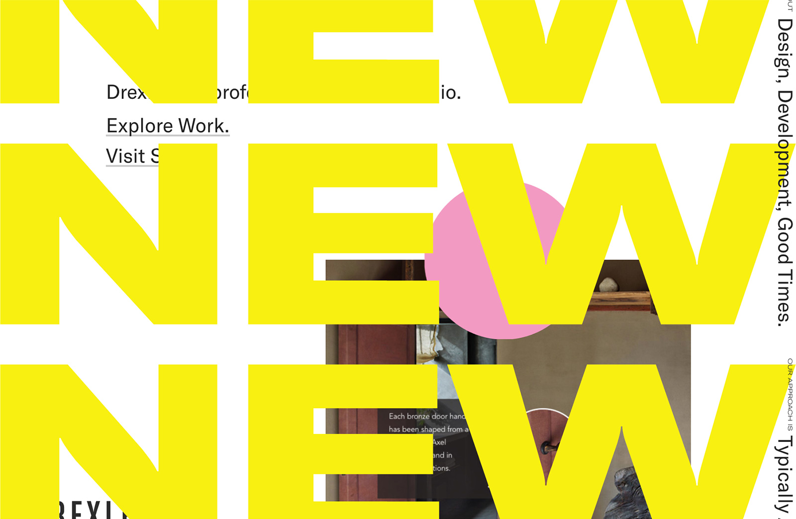
This site is often the first thing anyone sees from Drexler. So it’s certainly tempting to overthink it. But for version 3.0, we didn’t second guess the direction. We’re comfortable with the notion that Drexler 3.0 is a temporary representation of our studio that will evolve and grow as we do.
What’s Under the Hood
Drexler 3.0 was built on a customized WordPress admin. As with every project, the code powering this site is unique to its application. This version, more so than previous ones, allows for greater accessibility for anyone in our studio to upload projects and editorial. You can expect to see new blog content (we promise) and new work much more frequently.
Make It Personal
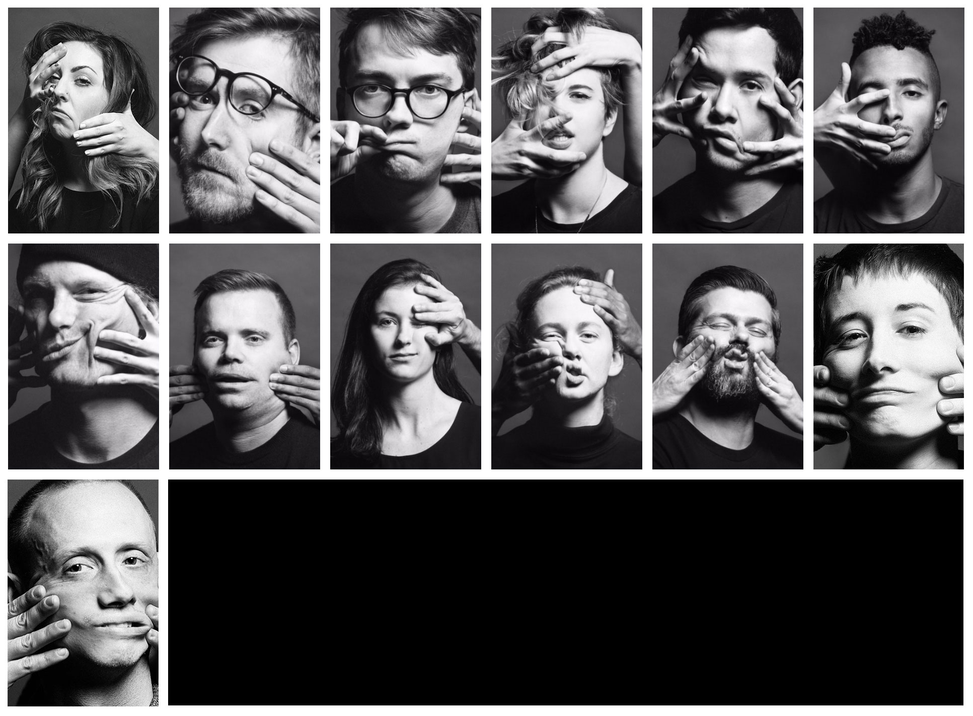
We had always been hesitant about putting too much focus on our faces. This time, however, we felt the need to break out of our collective comfort zone. We asked our friends at Unconquered to help us create portraits that expressed our creative vision and were unexpected. They had the unique challenge of capturing portraits while the subject was having their face manipulated by another member of the studio. The idea of not having control over your face made taking the portraits somehow easier to shoot and yielded some memorable head shots.
Loud and Clear
Drexler 3.0 has a few visual and audio features that we knew we wanted to incorporate. The marquee is a callback to a little piece of 90s HTML nostalgia that also functioning as navigation. The dot became an important part of the direction and allowed us to introduce color in a new way. It also acts as a portal to chat with us. While we didn’t include autoplay tunes on each page, we did want to create a more sensory experience by utilizing sound (designed by our resident composer, Caleb) in the interface.
On to the Next One
We’re excited about where we are, but are always looking forward to adding content and evolving the site in the coming months. Drop a note and let us know what you think.